Fujifilm Pro 400H Look on the Ricoh GR III: Complete Film Recipe Guide
When Fujifilm discontinued Pro 400H in 2021, wedding and lifestyle photographers mourned it like a lost friend. No other color negative film captured light quite the way it did: soft pastel greens, milky highlights that never clipped harshly, and skin tones so creamy and forgiving they made overcast afternoons look like a dream. Prices for the remaining stock skyrocketed, and a whole genre of photography lost its signature look overnight.
The good news? You can get remarkably close to that look in-camera with your Ricoh GR III — no expired film, no scanning, no Lightroom. In this guide we'll break down a complete Fujifilm Pro 400H film recipe for the GR III, explain why each setting matters, and share the shooting conditions where this look truly comes alive.
What Makes the Fujifilm Pro 400H Look
Before touching a single slider, it helps to understand what you're chasing. Pro 400H is defined by a handful of unmistakable traits:
- Soft, pastel color palette — nothing is loud; everything feels gently muted
- Minty, slightly cool greens that lean cyan rather than yellow
- Airy, protected highlights that roll off smoothly instead of clipping to white
- Creamy, flattering skin tones with a faint pink-neutral warmth
- Low overall contrast with lifted shadows and a flat, "exposed-to-the-right" tonality
- A clean, fine grain that stays subtle even at 400 ISO
Where Kodak Portra pulls warm and golden, Pro 400H sits cooler and more pastel — think "morning light through a window" rather than "golden hour glow." The film was famous for being overexposed by one or two stops, which is exactly how it got those bright, airy, low-contrast results. We'll lean on that same technique below.
The Ricoh GR III Fujifilm Pro 400H Recipe
Head into MENU > Image Control on your Ricoh GR III and dial in the following:
| Setting | Value | |---|---| | Base | Positive Film | | Saturation | -1 | | Hue | +1 | | Key (Brightness) | +2 | | Contrast | -2 | | Contrast (Highlight) | -2 | | Contrast (Shadow) | +1 | | Sharpness | -1 | | Clarity | -1 | | Shading | 0 | | Toning | 0 | | White Balance | Color Temp (K) | | WB Value | 6200K | | WB Compensation | G2 / B1 |
The settings doing the heavy lifting here are Key, Contrast, and white balance compensation. The +2 Key brightens the whole frame to mimic Pro 400H's signature overexposed exposure — this is the single most important move, because the look is the brightness. The -2 Contrast paired with -2 Highlight contrast flattens the tonal curve and protects highlights so they roll off softly instead of blowing out, while +1 Shadow contrast keeps the lifted shadows from turning muddy.
The G2/B1 white balance shift is what gives you those minty, cool-leaning greens that separate Pro 400H from warmer Kodak stocks. The slightly negative Saturation (-1) keeps the palette pastel rather than vivid, and the small -1 Clarity and -1 Sharpness add that gentle, soft-focus film smoothness.
Pro tip: expose to the right
The fastest way to make this recipe look like real Pro 400H is to overexpose by +0.7 to +1.3 EV using exposure compensation, on top of the +2 Key. Real photographers rated this film at ISO 200 or even 100 to flood the negative with light. On the GR III, dial in positive exposure compensation until your highlights sit just below clipping on the histogram. If skin tones or skies look gray and flat, you haven't given it enough light yet — push brighter.
Best Conditions for the Pro 400H Look
This recipe rewards soft light and punishes harsh contrast. Knowing when to reach for it makes all the difference.
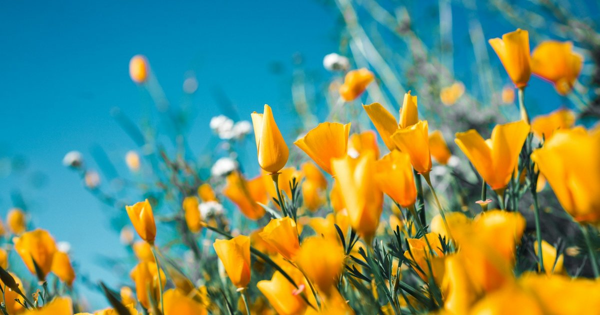
Open shade and overcast days
This is Pro 400H's natural home. Diffused, shadowless light lets the pastel palette and lifted shadows shine without any harsh contrast to fight against. Portraits in open shade look especially gorgeous — creamy skin, soft backgrounds, no squinting.
Backlit golden hour
Shoot toward a low sun with your subject backlit and let a little flare creep in. The protected highlights hold the bright background together while the lifted shadows keep your subject's face soft and detailed. This is the classic "dreamy wedding" look the film was built for.
Window light indoors
For lifestyle and still-life shots, place your subject beside a large window with sheer curtains. The soft directional light combined with this recipe produces that airy, editorial, slightly faded magazine feel.
Where it struggles
Harsh midday sun and high-contrast scenes will fight this recipe — the flat tonality can look washed out when there's no soft light to work with. In those conditions, either wait for better light or reach for a punchier recipe instead.
Shooting Tips to Sell the Look
- Embrace negative space and pastels. Pro 400H images often feel calm and minimal. Look for muted color palettes — sage greens, dusty pinks, soft blues — rather than bold primary colors.
- Keep skies in the frame. The recipe renders pale, slightly cyan skies beautifully. A sliver of soft sky at the top of a composition reads instantly as film.
- Photograph people. This recipe was born for portraits. Skin tones are where Pro 400H earned its legendary reputation, so don't hide it away on landscapes alone.
- Shoot wide and let it breathe. The GR III's 28mm-equivalent field of view suits the airy, environmental style this look is known for. Include context around your subject.
- Don't chase contrast in post. If you edit the JPEGs afterward, resist the urge to add contrast or saturation. The whole point of Pro 400H is its restraint.
How It Compares to Other Film Recipes
If you've already tried our other Fujifilm and Kodak recipes, here's where Pro 400H fits:
- vs. Kodak Portra 400 — Portra is warmer and slightly more saturated; Pro 400H is cooler, greener, and more pastel
- vs. Fujifilm Superia 400 — Superia is punchy and vivid with cool shadows; Pro 400H is the soft, low-contrast opposite
- vs. Kodak Gold 200 — Gold is nostalgic and golden-warm; Pro 400H is airy and minty-cool
Pro 400H is the recipe to reach for when you want gentle — soft light, soft color, soft contrast. It's the antidote to an over-saturated Instagram feed.
Final Thoughts
Fujifilm Pro 400H may be gone from store shelves, but its look lives on in any camera capable of getting close to its pastel, airy character — and the Ricoh GR III gets remarkably close. Load this recipe into one of your custom Image Control slots, expose generously, seek out soft light, and you'll be capturing those creamy, dreamy frames straight out of camera.
The best part: no expired film to hunt down, no lab fees, and no waiting for scans. Just dial it in, overexpose a touch, and shoot. Pro 400H is back — it's just living in your GR III now.
Want more in-camera film looks? Browse our full collection of Ricoh GR III preset recipes and turn your camera into a film simulation machine.