Kodak UltraMax 400 Look on the Ricoh GR III: Complete Film Recipe Guide
If Kodak Gold 200 is the sound of a lazy summer afternoon, Kodak UltraMax 400 is the energy of the whole day out — brighter, punchier, and a little more saturated. It's the higher-speed consumer film that filled point-and-shoots and 35mm compacts everywhere: vivid reds, warm-but-not-syrupy color, and just enough contrast to make a snapshot pop. The best part is that you can get remarkably close to that look in-camera with your Ricoh GR III, with no film, scanning, or Lightroom involved.
In this guide we'll break down a complete Kodak UltraMax 400 film recipe for the Ricoh GR III, explain why each setting matters, and share a handful of shooting tips to make the look really sing.
What Makes the Kodak UltraMax 400 Look
Before touching any sliders, it helps to know what you're chasing. UltraMax 400 has a personality of its own, and it's distinct from Gold 200 or Portra:
- Warm color balance, but cleaner and less golden than Gold 200
- Higher saturation and contrast — colors are vivid and a touch punchy
- Bold, slightly orange-leaning reds that make signs, clothing, and skin tones jump
- Visible grain thanks to its ISO 400 speed, giving images texture and an honest, analog feel
- A cheerful "everyday snapshot" character rather than a polished, cinematic one
The Ricoh GR III's Image Control system handles this beautifully. Its Negative Film base already leans into color-negative character, and from there it's about adding warmth, saturation, and a little contrast — without letting the shadows go muddy.
The Ricoh GR III Kodak UltraMax 400 Recipe
Head into MENU > Image Control on your Ricoh GR III and dial in the following settings:
| Setting | Value | |---|---| | Base | Negative Film | | Saturation | +3 | | Hue | 0 | | Key (Brightness) | 0 | | Contrast | +1 | | Contrast (Highlight) | -1 | | Contrast (Shadow) | +1 | | Sharpness | +2 | | Clarity | +1 | | Shading | +1 | | Toning | 0 | | White Balance | Color Temp (K) | | WB Value | 6500K | | WB Compensation | A3 / M2 |
The settings doing the heavy lifting here are white balance, saturation, and contrast. Setting the Kelvin value to 6500K keeps the frame warm without tipping into the deep gold of a Gold 200 recipe — UltraMax is warm, but it's a brighter, more neutral warmth. The A3/M2 compensation nudges color toward amber and a hint of magenta, which is exactly where UltraMax's reds and skin tones sit.
The +3 saturation delivers that vivid, drugstore-film color, while the +1 contrast and +1 shadow contrast add the punch UltraMax is known for — slightly deeper shadows and more separation between tones than the gentler Gold look. Pulling highlight contrast down to -1 protects bright skies and reflective surfaces so they don't clip harshly, mimicking how color-negative film rolls off its highlights.
Pro tip: lean on a little grain
UltraMax 400 is, by nature, a grainier film than its 200-speed siblings — and that grain is part of the charm. Rather than fighting noise, shoot this recipe at ISO 400–1600 and let a touch of texture reinforce the analog feeling. On the GR III, the noise at these ISOs reads pleasingly film-like with this profile.
Save it to a User mode
Don't re-enter these values every time. Store the recipe in one of the Ricoh GR III's User modes (U1, U2, U3) so the UltraMax look is one dial-click away. Pair it with Snap Focus at 2.5m and you've got a true point-and-shoot film camera in your pocket — fittingly, exactly the spirit of UltraMax.
If you'd rather skip the menu-diving entirely, our Ricoh GR III preset collection packages tested film-inspired recipes — including the camera screenshots — so you can copy a look in under a minute.
Best Conditions for the UltraMax 400 Look
This recipe rewards certain light. Knowing when to reach for it makes all the difference.
Bright daylight and open sun
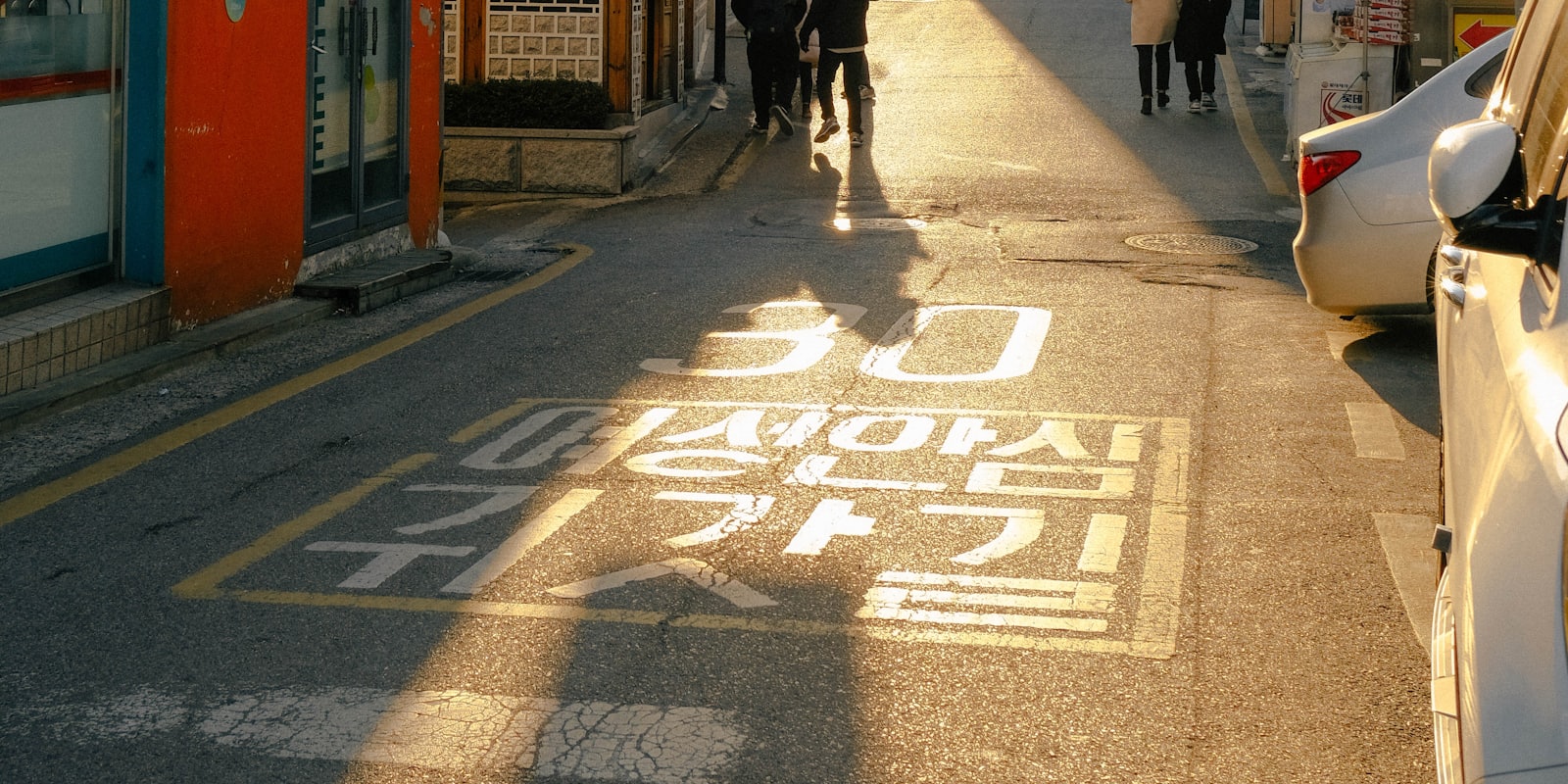
UltraMax was built for sunshine, and so is this recipe. Direct, mid-morning to late-afternoon light brings out its vivid saturation and lets the higher contrast shine. Strong colors — red awnings, blue skies, painted walls — render with that punchy, slightly exaggerated pop the film is loved for.
Street and travel snapshots
The look flatters busy, colorful, lived-in scenes: market stalls, shopfronts, neon at dusk, crowded sidewalks. Because the Ricoh GR III is so discreet, it's a natural fit for candid street and travel work where you want energetic, finished-looking JPEGs without carrying a second camera or editing later.
Overcast and golden hour
On cloudy days, drop the Kelvin value to roughly 6000–6200K so the scene doesn't read too cool. During golden hour, the recipe amplifies warm light beautifully — though you can pull saturation back to +2 if the colors start to feel oversaturated in already-warm conditions.
Where to be careful
Under fluorescent or mixed indoor lighting, the warm white balance can drift slightly orange. In those cases, switch to Auto White Balance or set a custom Kelvin around 4500–5000K, and keep the rest of the recipe intact. The contrast and saturation still carry the UltraMax character even with a neutral white balance.
Getting the Most From the Recipe
A few practical habits will lift your results well beyond the settings themselves.
Expose for the highlights
Negative Film handles shadows gracefully, but the GR III can still lose highlight detail quickly. In even light, +0.3 exposure compensation lifts the midtones nicely; in bright, contrasty scenes, pull back to protect skies and bright surfaces. UltraMax's contrast is forgiving in the shadows, so when in doubt, expose a touch under and let the deep tones do the work.
Embrace 28mm storytelling
The GR III's fixed 28mm lens encourages you to get close and include context. That suits the UltraMax aesthetic, which is all about capturing moments in their environment rather than isolating subjects. Frame people within the scene, include foreground elements, and lean into the slightly imperfect, in-the-moment energy that made consumer film so charming.
Don't chase clinical color
The point of an UltraMax recipe is character, not accuracy. If a red sign looks a little more orange-red than reality, or a sky reads slightly warm, that's the film talking. Resist the urge to "correct" it — those small deviations are precisely what sell the analog look.
Kodak UltraMax vs. Other Warm Film Recipes
If you love this look, it's worth understanding how it differs from neighboring recipes. A Kodak Gold 200 recipe is warmer and softer — more golden, lower contrast, built for gentle afternoon light. A Portra-style recipe is far more restrained, with pastel tones and muted saturation aimed at portraits. UltraMax sits in the punchy, vivid, everyday corner: brighter than Gold, more saturated than Portra, and a touch grainier than both. It's the most energetic of the warm-film family and the easiest to use in harsh midday light.
Trying several warm recipes side by side on the same scene is the fastest way to learn what each white balance, saturation, and contrast combination actually does — a great exercise for any Ricoh GR III owner building their own style.
Final Thoughts
The beauty of a Kodak UltraMax 400 recipe on the Ricoh GR III is how little it asks of you. Once it's saved to a User mode, you simply point, shoot, and get vivid, punchy, finished JPEGs straight out of camera — no film costs, no scanning, no editing. Just that timeless drugstore-film look on demand, ready for bright streets and colorful days.
If you'd like a library of tested, ready-to-load film-inspired looks for your GR III, browse our Ricoh GR III preset collection. Each one is built and verified on a real GR III, so you can spend less time in menus and more time shooting.