Ricoh GR III Abstract Photography: Settings, Tips, and Best Recipes
Abstract photography strips a scene down to its essential elements -- shape, line, color, texture, and light. It is less about what is in the frame and more about how the frame is built. The Ricoh GR III, with its fixed 28mm equivalent lens, fast operation, and pocketable form factor, is an excellent abstract camera precisely because it forces you to work with what is in front of you. No zoom to lean on, no lens swap to delay the moment -- just you, a tight focal length, and the discipline of seeing.
This guide covers the camera settings, preset recipes, and field techniques that will help you build a stronger abstract eye and a more graphic body of work with the GR III.
What Makes a Photograph Abstract
Abstract photography is not a single style. It lives on a spectrum, from semi-representational images that simplify a recognizable subject to pure compositions where the original subject is unidentifiable. The thread that ties them together is intent: the photograph is about its own visual structure, not about telling you what the world contains.
Strong abstract images usually rely on one or more of the following:
- Isolated shapes -- a single rectangle of light, a circle of shadow, a triangle of color, freed from context
- Repeating patterns -- tiles, windows, fences, ripples, leaves, brushstrokes
- Texture as subject -- peeling paint, rusted metal, weathered wood, cracked asphalt
- Strong line work -- diagonals, curves, intersections that lead the eye through the frame
- Color as the protagonist -- two or three tones in deliberate relationship, with everything else excluded
- Light and shadow as form -- the subject is the shape of the light itself, not the object the light is hitting
The GR III's wide-angle lens encourages you to move close, fill the frame, and exclude distractions. This is exactly the discipline abstract photography demands.
Essential Camera Settings for Abstract Work
Shooting Mode: Aperture Priority
Aperture Priority (Av) is the most flexible mode for abstract photography. Most abstract subjects are static -- walls, patterns, light pools -- so shutter speed rarely matters. Aperture controls depth of field, which directly shapes the graphic feel of the image. Set the aperture, let the camera handle shutter speed, and use exposure compensation to push the mood.
For abstracts that depend on motion -- a blurred crowd, a panning streetcar, a long exposure of water -- switch to Shutter Priority (Tv) or Manual (M) so you can dial in the blur deliberately.
Aperture Selection
Aperture is the most expressive setting for abstract work because it controls how much of the scene falls into and out of focus.
- f/2.8 for shallow-depth abstracts: isolated color, glowing bokeh, soft texture, dreamy minimalism. Everything except the focus plane melts into form
- f/5.6 for general abstracts where you want detail in the subject but not in the background -- the everyday workhorse
- f/8 for sharp, graphic compositions: architecture, patterns, surfaces shot parallel to the sensor where corner-to-corner sharpness matters
- f/11 for hyperfocal abstracts where you want both foreground texture and background pattern equally sharp
Stopping down past f/8 introduces diffraction, but for abstract work that is rarely a problem because the textural integrity matters more than absolute resolution.
ISO Strategy
Most abstract work happens in conditions where you control the variables. Keep ISO low when you can:
- ISO 200 as your base for outdoor, daylight, and tripod-supported abstracts
- ISO 400-800 for handheld interior work, museum walls, gallery details, or indoor textures
- ISO 1600-3200 when shooting abstracts at night -- shadow patterns under streetlights, neon signs reduced to color blocks, light pools on wet pavement
Auto ISO with a ceiling of 1600 and a minimum shutter speed of 1/60s is a sensible default for handheld abstracts in mixed light. The GR III's Shake Reduction system buys you another two to three stops when shooting static subjects, which extends your usable ISO range considerably.
White Balance: Honor the Color Story
Abstract photography lives or dies by color relationships. Auto White Balance averages those relationships away, which is often the wrong choice.
- Daylight (5200K) preserves the natural color of the scene. Use this when the existing color palette is already what you want
- Shade (7000K) or Cloudy (6500K) warms the image, useful for golden, ochre, or earth-toned subjects where you want extra richness
- Tungsten (3200K) cools the image dramatically, ideal for blue-dominant abstracts or for pushing neutral scenes toward a cinematic blue cast
- Manual Kelvin gives you the most control. Pick a value that emphasizes the color you want to dominate the frame
- CTE (Color Temperature Enhancement) exaggerates the existing color cast, which is exactly what you want when shooting bold single-color abstracts
The deliberate choice of white balance is one of the most underused techniques in abstract photography. Two photographers shooting the same wall can produce two completely different abstracts based on this single setting.
Metering and Exposure
Abstract scenes often have unusual brightness distributions -- a single bright shape against deep shadow, or an entire frame filled with mid-tones. Standard meters can get confused.
Center-weighted metering is the most reliable choice for abstracts because it gives consistent readings you can offset predictably with exposure compensation.
Spot metering is powerful for high-contrast abstracts. Point at the brightest or darkest area you want to preserve, lock the exposure, and recompose. This is how you nail a single sunlit rectangle against a dark wall.
Use exposure compensation to control the abstract feel:
- -1.0 to -1.5 EV for moody, low-key abstracts where shadows dominate and only the brightest shape carries detail
- +0.7 to +1.3 EV for high-key abstracts where the frame goes bright, white, or pastel and the subject is a single dark or saturated shape
- 0 to -0.3 EV for balanced graphic abstracts with rich mid-tones
Focus Settings
Abstract work asks for precise focus control because the subject is often small, off-center, or far from the camera's idea of "where to look."
AF with Select point is your default. Place the focus point exactly where you want the eye to land. The GR III lets you move the AF point with the directional pad while looking through the rear screen.
Snap Focus is the GR III's signature feature, and it works beautifully for abstracts. Pre-set the focus distance to 1m, 2m, or 2.5m and shoot without waiting for AF confirmation. For repeating patterns, walls, and textures shot from a consistent distance, Snap Focus is faster and more reliable than AF.
Manual Focus with focus peaking is essential when shooting through glass, into reflections, or at very close distances where AF struggles. Enable focus peaking in red for high visibility against most subjects.
Best Preset Recipes for Abstract Photography
Graphic Minimal
A clean, high-contrast recipe that emphasizes shape and line over texture. Set Image Control to Standard, push Contrast to +2 for hard separation between elements, and set Sharpness to +2 for crisp edges. Use Daylight white balance to preserve natural color relationships. Set Saturation to 0 -- you want the contrast to do the work, not the color. Excellent for architectural abstracts, signage, and bold geometric compositions.
Color Block
Built for abstracts where two or three saturated colors do the heavy lifting -- a red door, a yellow wall, a blue shutter. Set Image Control to Vivid, Saturation to +2 for maximum punch, and Contrast to +1. Use CTE white balance to enhance the dominant color cast. Set Sharpness to +1 to keep edges defined. The result is a poster-like rendering that turns any scene with strong color into a graphic statement.
Shadow Study
A moody, low-key recipe designed for abstracts built around light and shadow shapes. Set Image Control to Hard Monotone for deep blacks and bright whites with no in-between mush. Push Contrast to +3 and Sharpness to +2. Use Highlight Adjustment at -1 to retain texture in the brightest areas while letting shadows fall to true black. Add Grain Effect at Low for a classic photographic feel. The image becomes about pure shape -- the where of the light, not the what underneath.
Faded Pastel
A soft, painterly recipe that suits texture studies, peeling paint, weathered surfaces, and atmospheric color fields. Set Image Control to Soft, Contrast to -2, Saturation to -1, and Sharpness to -1. Use Shade white balance for warm ochre tones. Set Shadow Adjustment to +2 and Highlight Adjustment to -2 to compress the tonal range into a narrow, dreamy middle band. The look feels like a faded Polaroid -- nostalgic, gentle, and quietly graphic.
Cinematic Slice
A balanced recipe for abstracts shot in mixed light -- interiors with window light, street scenes reduced to slabs of color and shadow, architectural slices. Set Image Control to Bleach Bypass for desaturated highlights with strong contrast. Set Contrast to +1, Saturation to -1, and Sharpness to +1. Use Manual Kelvin at 4500K for a slightly cool, filmic feel. The result has the muted, cinematic quality of a still frame from a contemporary film -- ideal when you want abstracts that feel like images from a larger story.
Composition Techniques for Abstract Photography
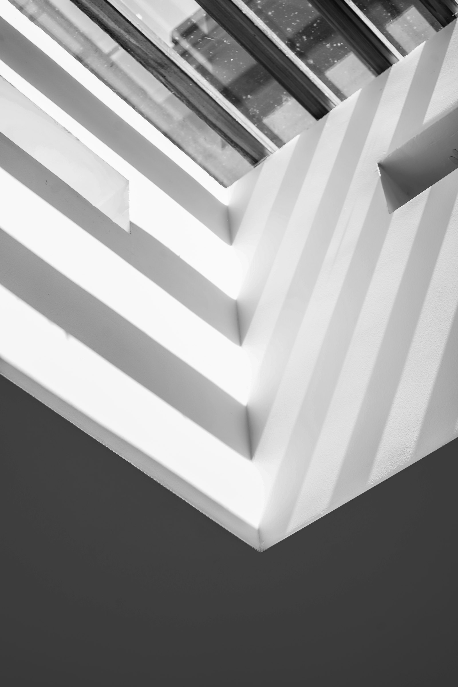
Fill the Frame
Abstract photography rewards intentional cropping. Use the GR III's wide 28mm field of view as a discipline: move closer until the subject fills the frame, eliminating everything that does not contribute to the composition. Negative space is fine, even essential -- but only the negative space you choose. Random sky in the corner is not negative space, it is mess.
Shoot Parallel
For pattern, texture, and architectural abstracts, shoot the subject parallel to the sensor. Stand directly in front of the wall, sign, or surface and keep the camera level. This eliminates perspective distortion and turns three-dimensional scenes into flat, graphic compositions. The GR III's built-in level indicator helps you nail this -- enable it through the menu and watch the on-screen guides.
Use the Edges
The four edges of the frame are compositional tools. Strong abstract images use the edges deliberately: a line that runs off the corner, a shape that touches the bottom edge, a column of color that bleeds out of the top. The edge of the frame becomes part of the image rather than a passive boundary. Look at every edge before pressing the shutter and ask: is this edge intentional?
Look for Repetition with a Break
A pattern of identical elements can be visually flat. The same pattern with one element broken -- a single closed shutter in a row of open windows, a single yellow brick in a wall of red -- creates immediate visual tension and gives the eye a point to land. This is one of the most reliable abstract compositions because it combines order with surprise.
Frame the Light, Not the Object
Many of the strongest abstract images are not about an object at all -- they are about the shape of light falling on a surface. Train yourself to see light pools, light rectangles, light triangles, light edges as the subject. The wall or floor underneath is just a screen. This shift in seeing is one of the most powerful changes you can make as an abstract photographer.
Crop In-Camera
The GR III's tight focal length means you cannot crop deeply in post without losing image quality. Compose carefully at capture time. Build the photograph in the viewfinder, not in Lightroom. This constraint is a feature, not a limitation -- it sharpens your eye and produces stronger images.
Field Techniques
Walk Slowly
Abstract photography rewards slow looking. Fast walking will not surface the textures, light pools, and color relationships that make abstracts work. Cut your pace in half. Stop frequently. Look up, look down, look behind you. Many of the best abstracts are hiding in plain sight on streets you have walked a hundred times.
Shoot Many Variations
When you find a strong abstract subject, do not take one shot and walk away. Work the scene. Try f/2.8 and f/8. Shoot horizontal and vertical. Move two steps left, three steps right. Frame tight, frame loose. The first composition is rarely the best, but it teaches you what to refine. The GR III's quick autofocus and instant shutter response make this kind of exploration fast and intuitive.
Use the 1:1 Aspect Ratio
Set Aspect Ratio to 1:1 through the menu for a square crop that often works better for abstract subjects than the standard 3:2. Square compositions emphasize the center of the frame and remove the visual bias toward horizontal or vertical orientation. Many of the most iconic abstract photographs in the medium's history were shot square. The GR III lets you see the 1:1 crop live on the rear screen, so you compose for it directly.
Get Low, Get High, Get Close
Most photography is shot at eye level. Most abstract photography is not. Get the camera on the ground, on a railing, against a wall, near a ceiling. The shift in perspective transforms ordinary scenes into abstract ones. The GR III's compact size makes these unusual angles easy -- it is not awkward to put on the ground or hold above your head.
Shoot Through Things
Glass, water, fences, plastic, fabric -- shooting through translucent or partially transparent objects creates immediate abstraction. The original subject is partially obscured, colors and shapes blend, and the result feels dreamlike. Lock focus on the layer you want sharp and let the rest go.
Long Exposure Abstraction
For motion-based abstracts -- light trails, blurred water, abstracted crowds -- use Shutter Priority (Tv) mode and set the shutter to 1/2s to 4s. Brace against a stable surface, use the 2-second self-timer to eliminate shake, and consider the GR III's built-in ND filter (in models that have it) to extend exposure times in daylight. Long exposures turn moving subjects into color smears and light streaks, which is abstract photography at its most kinetic.
Common Abstract Photography Mistakes to Avoid
Treating abstract as "lazy composition." Abstract photography is more compositional, not less. Every element has to earn its place because there is no narrative or subject to carry the image. A cluttered abstract is just clutter.
Centering everything by default. Center compositions can be powerful for abstracts, but only when deliberate. Use the rule of thirds, the golden ratio, dynamic symmetry -- but use something. Random placement is almost always weaker than chosen placement.
Over-relying on heavy post-processing. Abstract photography looks best when the abstraction is built in-camera. Cranking saturation, contrast, and clarity in post can produce a flashy image, but it usually has the surface quality of an Instagram filter rather than a photograph. Build the look at capture time with white balance, exposure, and composition.
Mistaking confusion for abstraction. A photograph that is hard to read is not automatically abstract. Strong abstracts are clear -- you immediately understand the shapes, colors, and structure even if you cannot identify the original subject. Confusion is a sign that the composition needs more work, not more abstraction.
Ignoring the corners. The corners of the frame carry visual weight. A random brightness in a corner pulls the eye away from the main composition. Check every corner before pressing the shutter.
Shooting the obvious abstract. Murals, graffiti, and street art are technically abstract subjects, but they are also already abstract images made by someone else. Photographing them well is essentially documentation. Look for the abstracts that exist in unintended places -- the shadow of a fire escape, the pattern of a manhole cover, the color block of a sun-bleached door.
Planning Abstract Photography Sessions
Light direction matters more for abstract work than for almost any other genre. Side light brings out texture; backlight creates silhouettes and rim-light shapes; overhead light flattens everything; and the long shadows of late afternoon turn ordinary streets into graphic compositions. Pay attention to the angle of the sun the way landscape photographers pay attention to weather.
Time of day also shapes color. Golden hour adds warmth and long shadows -- perfect for shadow-shape abstracts. Blue hour gives you cool-warm contrast that turns ordinary urban scenes into color blocks. Overcast midday produces soft, flat light that is excellent for color and pattern work where harsh shadow would compete with the subject. Each lighting condition opens a different kind of abstract.
Location matters less than seeing. You can find strong abstracts in your own neighborhood, in airports, in parking garages, in supermarket aisles. The GR III's compactness encourages you to carry it everywhere, and abstract photography rewards that habit more than any other genre.
Putting It Together
Abstract photography with the Ricoh GR III is a practice in seeing rather than shooting. The camera's fixed 28mm lens, fast operation, and pocketable form factor remove distractions and put you in direct contact with the world's shapes, colors, and patterns. Set your aperture for the depth-of-field feel you want, lock your white balance to honor the color story, and use the GR III's Snap Focus to capture the abstracts you see before they change.
The longer you shoot abstracts with the GR III, the more abstracts you will start to see -- and the more your everyday photographs will benefit from the compositional rigor abstract work demands.
Explore our graphic and minimalist presets for recipes built around bold shapes and clean color, or grab a complete preset bundle that covers abstract work alongside every other genre and lighting condition.