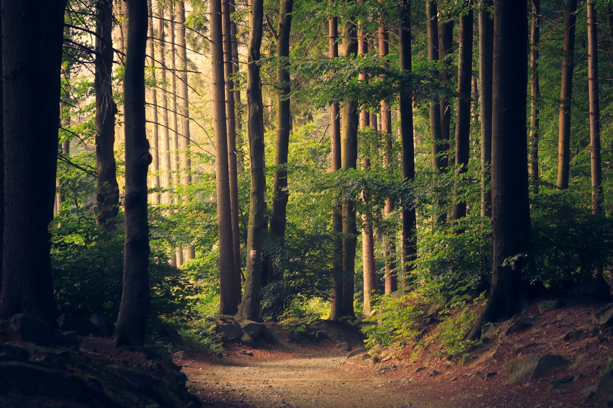
Kodak ProImage 100 Recipe for the Ricoh GR III: Warm, Punchy Portrait Color
Kodak ProImage 100 spent decades as a quiet secret. Originally engineered for professional portrait and event shooters working in the warm, bright climates of Latin America and Asia, it was never widely sold in Europe or North America — so most photographers never touched it. Then it went worldwide, the film revival caught up with it, and shooters discovered what those working pros already knew: ProImage 100 delivers gorgeous warm skin tones, punchy-but-natural color, and remarkably fine grain, all at a friendlier price than its Portra sibling. It's the film you reach for when you want portraits and warm daylight scenes that look rich and inviting without tipping into the heavy-handed saturation of a consumer stock. The best part? You can get remarkably close to that look in-camera on your Ricoh GR III — no scanning, no Lightroom pass, no film budget.
In this guide we'll build a complete Kodak ProImage 100 film recipe for the Ricoh GR III, explain why each setting matters, and cover the light and subjects where the look truly sings.
What Makes the Kodak ProImage 100 Look
Before touching the menu, it helps to know exactly what you're chasing. ProImage 100 has a signature that sits in a very specific and appealing place between the neutral pro films and the punchy consumer ones:
- Warm, flattering skin tones that lean gently toward amber without going orange
- Punchy, saturated reds and warm hues — this film loves red, terracotta, and golden light
- Restrained, natural greens and blues so the warmth never becomes a cartoon
- Fine grain that's noticeably cleaner than Gold 200 or UltraMax at the same enlargement
- Moderate-to-low contrast with a wide exposure latitude that holds both highlights and shadows
- A "true but warm" honesty — realistic color with a comfortable, sunlit glow
Where Kodak Gold 200 shouts nostalgia and Kodak Portra 160 whispers in pastels, ProImage 100 speaks at a warm, confident conversational volume. The GR III's Negative Film base is the perfect starting point: we hold saturation high but just short of Gold, push white balance warm, and keep contrast open so the film's generous latitude comes through.
The Kodak ProImage 100 Recipe for Ricoh GR III
Head into MENU > Image Control on your Ricoh GR III and dial in the following settings:
| Setting | Value |
|---|---|
| Base | Negative Film |
| Saturation | +3 |
| Hue | 0 |
| Key (Brightness) | 0 |
| Contrast | -1 |
| Contrast (Highlight) | -1 |
| Contrast (Shadow) | -1 |
| Sharpness | +2 |
| Clarity | +1 |
| Shading | 0 |
| Toning | 0 |
| White Balance | Color Temp (K) |
| WB Value | 6300K |
| WB Compensation | A3 / M2 |
| Grain Effect | Weak |
| ISO | Auto 100–1600 |
Save this to one of your User custom modes (U1–U3) so you can recall the ProImage look with a single dial-click.
Why these settings work
Negative Film as the base gives you the smooth tonal roll-off and film-like color response that no amount of tweaking Standard can match. It's the honest starting point for any color negative recipe on the GR III.
Saturation at +3 is the deliberate difference from a Gold recipe. ProImage is punchy, but it's a professional portrait film — it never lets color overwhelm skin. Pulling back one notch from Gold's +4 keeps reds and warm tones vivid while leaving faces looking natural rather than sunburnt.
White balance at 6300K with A3/M2 compensation is the single biggest contributor to the look. The warm Kelvin value pushes the whole frame toward amber daylight, and the light amber/magenta nudge places the color exactly where ProImage sits — warm and slightly rosy, but not orange. This is warmer than a neutral pro film but more controlled than Gold's 6900K.
Contrast at -1 with highlights and shadows both pulled to -1 recreates ProImage's wide latitude and open shadows. This film is famous for being forgiving — it holds detail in bright skin and dark hair alike. Keeping contrast gentle preserves that full, flexible tonal range and sells the "film" feeling.
Sharpness at +2 and Clarity at +1 give you the crisp-but-not-clinical rendering ProImage is known for. The GR III's excellent 28mm lens is already sharp; a modest push adds bite without making the image look digital or brittle.
Grain Effect set to Weak honors ProImage's genuinely fine grain. Unlike grittier stocks, this film is prized for how clean it stays — a light touch of grain adds authenticity while respecting the film's smooth character. Turn it Off entirely if you want the cleanest possible files.
ISO capped at 1600 keeps noise low so the fine-grain quality survives. ProImage is a true ISO 100 daylight film, so this recipe is happiest in good light.
A "Golden Hour Portrait" Variation
ProImage 100 was built for people in warm light, and golden hour is where it becomes magic. For portraits in late-afternoon sun, warm the recipe further and soften it for flattering skin:
| Setting | Value |
|---|---|
| Base | Negative Film |
| Saturation | +2 |
| Hue | 0 |
| Key (Brightness) | +1 |
| Contrast | -2 |
| Contrast (Highlight) | -2 |
| Contrast (Shadow) | 0 |
| Sharpness | +1 |
| Clarity | 0 |
| White Balance | Color Temp (K) |
| WB Value | 6700K |
| WB Compensation | A4 / M2 |
| Grain Effect | Weak |
Dropping saturation and clarity keeps skin smooth and natural, the lifted key and softer highlights give a bright, airy feel, and the warmer 6700K white balance leans into that honeyed golden-hour glow. Exposure compensation of about +0.3 finishes the high-key, flattering look.
An "Everyday Snapshot" Variation
Part of ProImage's charm is how well it works as a walk-around, point-and-shoot film for markets, cafés, and warm street scenes. For punchier all-purpose color, try this:
| Setting | Value |
|---|---|
| Base | Negative Film |
| Saturation | +4 |
| Hue | 0 |
| Key (Brightness) | 0 |
| Contrast | 0 |
| Contrast (Highlight) | -1 |
| Contrast (Shadow) | -1 |
| Sharpness | +2 |
| Clarity | +2 |
| White Balance | Color Temp (K) |
| WB Value | 6100K |
| WB Compensation | A2 / M1 |
| Grain Effect | Weak |
This version pushes saturation and clarity for vivid, ready-to-share color while keeping the warmth slightly more neutral so mixed light and shade still read cleanly.
ProImage 100 vs. Gold 200 and Portra 160 on the GR III
These three warm Kodak stocks are the classic decision point, and knowing the difference tells you which recipe to reach for:
- Warmth: Gold 200 is the warmest and most nostalgic; ProImage 100 is warm but more refined; Portra 160 is the most neutral and pastel.
- Saturation: Gold is the punchiest, ProImage sits just below it, Portra is the most restrained.
- Grain: ProImage 100 is the cleanest of the three at ISO 100; Gold 200 shows more texture; Portra is fine but slightly softer.
- Skin tones: Portra flatters with pastel neutrality, ProImage flatters with warm rosiness, Gold pushes skin distinctly golden.
Think of it this way: shoot the Gold 200 recipe when you want maximum nostalgic warmth, the Portra 160 recipe when you want clean pastel portraits, and this ProImage recipe when you want the warm, punchy, professional middle ground. Many GR III shooters keep all three saved to separate User modes and switch based on the light and subject. For a brighter, higher-speed everyday warm option, the Kodak UltraMax 400 recipe is a natural companion.
Best Subjects and Light for the ProImage Look
ProImage 100's warm, saturated, forgiving character rewards certain subjects more than others. Lean into them:
- Portraits and people — warm skin tones and gentle contrast make this a natural for faces, family gatherings, and candid moments.
- Warm daylight and golden hour — the film was engineered for bright, warm light, and it glows in late-afternoon sun.
- Reds, terracotta, and earth tones — markets, brick streets, autumn foliage, and warm architecture come alive with ProImage's love of red.
- Sunny travel and social scenes — cafés, festivals, and street markets suit its inviting, true-but-warm palette.
- Even, generous light — the wide latitude thrives when there's plenty of light to hold both highlights and shadows.
Because ProImage is a true ISO 100 daylight film, it's least happy in dim interiors and deep shade. When the light drops, switch to a faster warm recipe like UltraMax 400 rather than pushing this one into the noise.
Shooting Tips for Authentic Results
Feed it light. ProImage 100 is a daylight film with real latitude, but it wants a well-exposed, brightish frame. When in doubt, expose a touch generously (+0.3 to +0.7) — the open shadows and warm highlights are where the look lives.
Chase warm light. This recipe and this film both reward golden hour, warm window light, and sunny afternoons. Shoot into or across warm light rather than flat midday sun for the most flattering results.
Let the warmth carry the mood. Resist the urge to "correct" the amber cast — that warmth is the ProImage look. If a scene feels too warm, nudge the WB value down toward 6000K rather than abandoning the color shift entirely.
Preview in JPEG, keep RAW as a safety net. Shooting this recipe as JPEG gives you the finished ProImage rendering right on the LCD, training your eye to see warm color. Shoot RAW+JPEG if you want a neutral file in your back pocket.
Pair it with Snap Focus. ProImage was a working portrait and event film — fast, reliable, point-and-shoot. Set Snap Focus to around 2.5m and the GR III becomes exactly that: a warm, decisive-moment machine in your pocket.
Final Thoughts
Kodak ProImage 100 earned its cult status the honest way — by quietly doing a hard job well for decades before the rest of the world noticed. Its blend of warm skin tones, punchy-but-controlled color, and genuinely fine grain fills a gap that Gold and Portra leave open, and it translates beautifully to the Ricoh GR III. With the Negative Film base tuned for warm daylight, +3 saturation, and a 6300K white balance, your GR III becomes a convincing ProImage machine — ready in your pocket for warm portraits, sunlit streets, and every golden-hour moment in between.
Load this recipe into a User mode, chase the warm light, and shoot as if a fresh roll of ProImage were loaded. You'll find the look — warm, rich, and quietly professional — is one you keep coming back to.
Want more warm color inspiration? Pair this with our Kodak Gold 200 recipe, Kodak Portra 160 recipe, Kodak UltraMax 400 recipe, and our roundup of the best Ricoh GR III film recipes for 2026 to build a complete warm-film toolkit on your GR III.
Get a free recipe + 15% off your first order
Our Natural Analog recipe (exact settings for the GR III, GR IIIx and GR IV) and a personal discount code, straight to your inbox.
No spam. Unsubscribe in one click.