Kodak Ektar 100 Look on the Ricoh GR III: Complete Film Recipe Guide
If Kodak Portra 400 is the film of soft skin and gentle pastels, Kodak Ektar 100 is its loud, fearless cousin. Marketed by Kodak as the world's finest-grain color-negative film, Ektar is built for saturation: electric blue skies, deep greens, vivid reds, and a crispness that makes landscapes and travel scenes leap off the page. It's the stock photographers reach for when they want color that announces itself.
The good news for Ricoh GR III shooters: you can get remarkably close to the Ektar look in-camera — no scanning, no Lightroom, no film budget. In this guide we'll dial in a complete Kodak Ektar 100 film recipe for the Ricoh GR III, explain why each setting matters, and cover the light and subjects that make the look truly sing.
What Makes the Kodak Ektar 100 Look
Before touching the menu, it helps to know exactly what you're chasing. Ektar 100 has a signature that's the polar opposite of a muted portrait stock:
- High, punchy saturation — especially in blues, greens, and reds, without tipping into cartoonish
- Deep, dramatic skies that render a rich cobalt blue on clear days
- Crisp, fine-grain detail thanks to its ISO 100 base — Ektar is famously sharp
- Strong, contrasty rendering with clean blacks and bright, controlled highlights
- Cool-neutral white balance rather than the warm cast of consumer films like Gold 200
Where Portra whispers, Ektar shouts. The trick on the GR III is to push saturation and contrast up — the mirror image of the Portra recipe — while keeping skin tones from going orange and skies from clipping. The GR III's Vivid Image Control base is the natural starting point: it already leans saturated and contrasty, exactly the territory Ektar lives in.
The Ricoh GR III Kodak Ektar 100 Recipe
Head into MENU > Image Control on your Ricoh GR III and dial in the following settings:
| Setting | Value | |---|---| | Base | Vivid | | Saturation | +2 | | Hue | 0 | | Key (Brightness) | 0 | | Contrast | +2 | | Contrast (Highlight) | -1 | | Contrast (Shadow) | +1 | | Sharpness | +2 | | Clarity | +2 | | Shading | +1 | | Toning | 0 | | White Balance | Color Temp (K) | | WB Value | 5400K | | WB Compensation | A1 / G1 |
The settings doing the heavy lifting here are saturation, contrast, and clarity. The +2 saturation on top of the already-vivid base delivers Ektar's signature color intensity, while +2 contrast with a +1 shadow contrast gives those deep, clean blacks the film is known for. The -1 highlight contrast is a deliberate safety valve — it stops bright skies and highlights from clipping to harsh white, preserving the controlled, detailed highlights that separate Ektar from a cheap over-saturated look.
+2 sharpness and +2 clarity recreate that famous fine-grain crispness — Ektar resolves detail beautifully, and pushing clarity adds the micro-contrast that makes textures like rock, foliage, and architecture pop. The 5400K white balance with A1/G1 compensation lands you in Ektar's cool-neutral zone: a hint of amber to keep things natural, with a touch of green that nudges foliage toward that rich, slightly cool Ektar green rather than a warm, yellowed tone.
Pro tip: lock it into a User Mode
Don't re-enter these settings every time. Save the recipe to one of the Ricoh GR III's User modes (U1, U2, U3) so the Ektar look is one dial-click away. Pair it with Snap Focus at 2.5m and Aperture Priority at f/5.6–f/8 for landscapes, and you have a pocketable, point-and-shoot vivid-color camera ready for any vista.
If you'd rather skip the menu-diving entirely, our Ricoh GR III presets package recipes like this one — including the camera screenshot — so you can copy them in under a minute.
Best Conditions for the Kodak Ektar Look
Ektar 100 was engineered for one job above all: rendering vivid, saturated color in good light. Knowing when to reach for it makes a big difference.
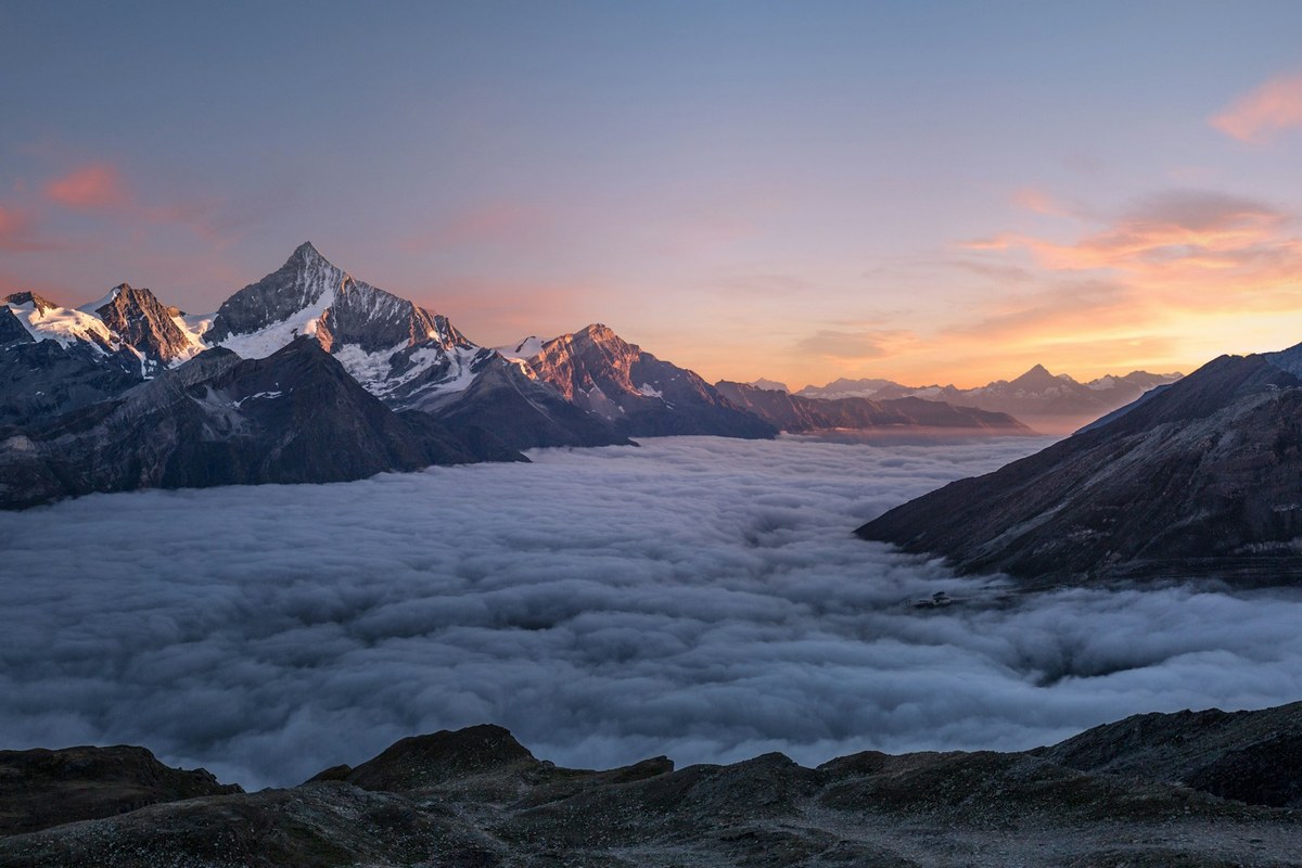
Bright daylight and blue skies
This is Ektar's home turf. Clear, sunny days with deep blue skies are where the recipe truly shines — the high saturation turns the sky a rich cobalt and makes any warm subject (red barns, autumn leaves, painted facades) glow against it. Shoot with the sun behind you for the most punch, and watch the blues come alive.
Landscapes and nature
The fine-grain crispness and high clarity make this recipe ideal for sweeping landscapes, forests, coastlines, and mountains. Stop down to f/5.6–f/8 for edge-to-edge sharpness, keep ISO at 100–200 to mirror Ektar's clean base, and let the saturation render foliage and water with vivid depth.
Travel and architecture
Colorful streets, markets, and painted buildings come alive with Ektar's saturation and contrast. The +2 clarity adds welcome structure to architectural detail, while the controlled highlights keep bright stucco and stone from blowing out under strong sun.
Shooting Tips for the Ektar Look
- Expose carefully — even slightly under. Unlike Portra, Ektar is not an over-exposure-friendly film. It has less highlight latitude, so protect your highlights by dialing in -0.3 to -0.7 exposure compensation in bright scenes. This keeps skies and highlights rich rather than washed out, and deepens those saturated colors.
- Chase good light. This recipe is built for strong, directional daylight. In flat, overcast light the high saturation can look slightly artificial, so save Ektar for sunny days and golden light.
- Mind the skin tones. Ektar's saturation can push skin toward orange or red. It's a landscape and travel film first — for portraits, reach for our Portra recipe instead, or pull saturation back to +1 if people enter the frame.
- Use a low ISO. Keep ISO at 100–400 to preserve the clean, fine-grain character. The GR III's APS-C sensor stays crisp here, matching Ektar's defining sharpness.
- Look for color contrast. Ektar rewards scenes with bold color relationships — a red kayak on blue water, yellow leaves against green pines. Compose around color and the recipe does the rest.
How It Compares to Our Other Kodak Recipes
If you've already tried our Kodak Gold 200 recipe and Kodak Portra 400 recipe, think of Ektar 100 as the most assertive of the three. Gold 200 brings warm, nostalgic saturation for everyday and travel scenes. Portra 400 pulls everything back for soft, accurate skin tones. Ektar 100 cranks color and contrast to the maximum for landscapes, nature, and vivid travel photography. Many GR III shooters keep all three saved to User modes: Gold on U1 for warm everyday scenes, Portra on U2 for people, and Ektar on U3 for landscapes and bold color.
Final Thoughts
Kodak Ektar 100 earned its reputation one impossibly vivid landscape at a time, and the Ricoh GR III is a natural tool for chasing that look — pocketable enough to carry on every hike and trip, sharp enough to match Ektar's fine grain, and equipped with an Image Control system flexible enough to render color the way Ektar does. Dial in the recipe above, lock it to a User mode, and head out into some bright light. You'll come back with landscapes and travel shots that have that unmistakable color-negative punch — straight out of camera.
Ready to make it effortless? Browse our complete collection of Ricoh GR III presets, including film-emulation recipes like this one, or grab a bundle to get our most popular looks together at the best value.